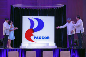
The controversy over the new slogan of the Department of Tourism has not yet died down when another government agency, which incidentally has to do with tourism, raised another furor. The Philippine Amusement and Gaming Corp. (PAGCOR) marked its 40th founding anniversary on Tuesday, Ju1y 11 by unveiling its new logo, replacing the old symbol of a stylized representation of two hands holding a star.
The agency’s new emblem features a stylized P in a flame-like design in bold shades of red and blue. PAGCOR Chairman Alejandro Tengco said the new logo “incorporates the element of fire associated with energy, inspiration, passion and transformation. It symbolizes the flame that ignites change and drives progress. The logo likewise reflects a beacon which symbolizes guidance, leadership and direction. It represents a guiding light that helps people find their way.”
Mr. Tengco added that the new logo “reflects PAGCOR’s long-standing commitment of being a guiding force that illuminates the way forward, drives transformation and development, and brings inspiration and motivation to the lives it touches.
The replacement of the old logo raised several issues. Why replace it in the first place? Is the new logo creative and appropriate, and was the fee for its creation reasonable? To answer these questions, we must first define what a logo is.
Catherine Slade-Brooking, researcher and senior lecturer on graphic communications and branding at the University for the Creative Arts in London, and who has been involved in design and branding projects of commercial entities, defines a logo as a simple device that employs a combination of shapes, colors, symbols and sometimes letters or words to represent the values, quality and promises offered by the manufacturer of a product or service.
Paul Hughes, author of the book “Designing Identities for Living Organizations,” wrote that a logo is a set of colors and a font to create a visual identity.
Wally Olins, reputed to be one of the world’s most respected and experienced practitioners of corporate identity and branding, says a logo or symbol is the central element of the visible recognition pattern. The other elements are color, typefaces, slogans, tone of voice and style of expression. They collectively form the visible recognition pattern of a brand.
David A. Aker, an authority on branding and author of the book “Building Strong Brands,” and professor emeritus of Marketing Strategy at the University of California, Berkeley, wrote that a logo, the central brand graphic, represents the brand in nearly all roles and contexts. The primary logo dimensions of color, layout and typeface can be varied to make a statement about the brand, its contexts and its relationship with other brands.
Philip Kotler, one of the world’s leading authorities on marketing and marketing guru at Northwestern University in Chicago, says that a logo is only one of the elements that represents a brand, which is essentially a marketer’s promise to deliver a specific set of features, benefits and services consistently to the buyer. In a way, it is a complex symbol that can convey attitudes, benefits, values, culture, personality and use.
So a logo means different things to different people. Graphic designer Catharine Slade-Brooking practically says that a logo is synonymous with brand because a logo to her symbolizes what the brand represents. Hughes, another designer, considers a logo as only a visual device for identity.
British branding practitioner Olin sees the logo as only one of a set of elements among other sets that identifies a brand. Aker, a brand strategist, like Slade-Brooking, considers the logo as the brand. But marketing consultant Kotler says that a logo is only one of the elements that represents a brand.
That brings us to the question of what a brand is. Up to the last decade of the 19th Century, many consumer goods like rice, flour, sugar, coffee, meat, vegetables and fruits were sold in the public markets as undifferentiated basic commodities. Even Coca-Cola, arguably the best-known brand in the world, was originally sold as a tonic drink dispensed in a pharmacy.
The emergence of large national companies selling their products to a rapidly growing consumer market made it necessary for manufacturers to distinguish the quality of their products from the inferior goods sold by competitors. Thus, the creation of brands.
The American Marketing Association defines a brand as a name, term, sign, symbol, or design, or a combination of these intended to identify the goods or services of a seller and to differentiate them from those of competitors.
PAGCOR is a 100% government-owned and -controlled corporation mandated to regulate, operate, authorize and license games of chance, games of cards and games of numbers, particularly casino gaming in the Philippines.
It generates revenues for the Philippine government’s sociocivic and national development programs, and helps promote the tourism industry.
In June 2007, the following amendments to the PAGCOR charter were made:
• PAGCOR could now enter into agreements, including joint ventures, with any person, firm, association or corporation.
• The requirement to obtain consent from the local government authority that has territorial jurisdiction over the area chosen as a site for any of PAGCOR’s operations.
• Exclusion of jai-alai from PAGCOR operations; and
• Delimitation of regulatory authority and power over gaming activities covered by other existing franchises, regulatory bodies or special law.
Whether a logo is a visual device used for identification or a brand that represents a set of attributes, benefits, values and personality, PAGCOR does not need a logo because it does not compete with others for attention and patronage from the consumer market.
For reasons unknown, it had a logo from the beginning. But the original logo of stylized representation of two hands holding a star has not been rendered inappropriate because the amendments to the PAGCOR charter did not modify the original mandate given to it. There was no valid reason to replace the original logo.
But as David A. Aker wrote, the primary logo dimensions of color, layout and typeface can be varied to make a statement about the brand. If the new administrators of PAGCOR found the old logo as not representative of what PAGCOR is all about, neither does the new one. Besides, the statement the new logo is supposed to make about PAGCOR — its commitment of being a guiding force — is irrelevant to the consumer market as well as to the general public because it does not affect them. Not only that, the new PAGCOR logo is not creative. It looks like a combination of the logos of Petron and Lucky Me!
The P3 million that was paid to the designer of the logo may have been a waste of taxpayers’ money.
Oscar P. Lagman, Jr. is a retired executive management professor and business consultant. He has experience in developing logos.


